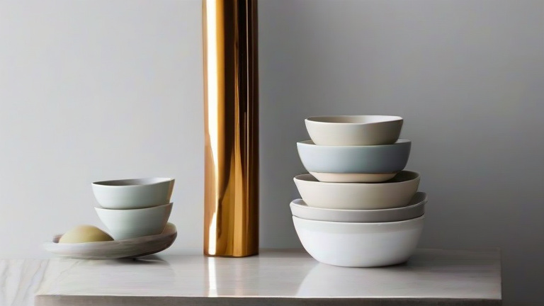
TL;DR: Style porcelain decor by mixing matte and gloss finishes, anchoring pieces with negative space, and layering heights from tabletop to floor. Start with one anchor piece per zone, then add complementary textures and neutral-toned accents for a cohesive, gallery-like look.
Step 1: Choose Your Anchor Piece
Begin with one large porcelain statement—a vase, a sculptural bust, or an oversized bowl. Place it at eye level on a console, mantel, or sideboard. This anchor defines the color palette (usually white, cream, or soft blue-grey) and the era’s mood: modern minimalism (clean lines), traditional (fluted or hand-painted), or eclectic (asymmetrical shapes). Avoid clutter: the anchor needs at least 10 inches of clear space around it.
If you want to dig deeper, check out our guide on Timeless Elegance: Elevating Your Home with Porcelain Decor.
Step 2: Build a Height Pyramid
Arrange three porcelain objects in a staggered triangle. For example: tall vase (24″+) on the left, medium ginger jar (12″) on the right, and a low dish (4″) in the center front. Vary heights by at least 4–6 inches per piece. If all items are similar height, use a stack of books or a wooden pedestal to lift one. Never place two identical-height pieces side by side—it reads as a set, not a styled vignette.
Step 3: Mix Finishes, Not Patterns
Combine matte unglazed porcelain with glossy glazed pieces. For instance, a matte white bud vase next to a glossy celadon bowl. If you choose patterned porcelain (like blue willow), keep it to one piece per zone. Pair it with solid, textured companions—a ribbed vase, a hammered catchall. This contrast creates depth without visual noise. Tip: match the undertone (warm cream vs. cool white) across all pieces for harmony.
Step 4: Add Natural Counterweights
Porcelain can feel cold. Soften it by pairing with organic elements: a dried pampas grass stem inside a tall vase, a small stack of linen-bound books, or a wooden tray under a porcelain bowl. Place a porcelain figurine on a rough-hewn stone slab. The contrast in texture makes the porcelain pop. Avoid plastic or shiny metal—they compete with porcelain’s refined texture.
Step 5: Use Negative Space and Lighting
Do not fill every shelf. Leave 30–40% of your surface empty. For a shelf vignette, place porcelain at the front edge, not against the back wall—this casts a soft shadow and adds dimension. Use a small LED spot lamp or a table lamp with a warm bulb to highlight the glossy curves. Angle the light from one side to reveal the glaze’s depth.
Step 6: Rotate Seasonally
Porcelain is durable but benefits from rotation. Swap heavy winter urns for lightweight spring bud vases. Store unused pieces with acid-free tissue between them. Never stack bowls without felt separators. Dust with a soft microfiber cloth—avoid water on unglazed porcelain.
FAQ
Q: Can I mix porcelain brands or sets?
A: Yes, but keep the color temperature consistent. Mixing a warm cream piece with a cool white piece looks accidental. Stick to one undertone, and vary shapes and finishes freely.
Q: How do I keep porcelain from looking too “grandma’s china”?
A: Avoid symmetrical rows of figurines. Choose one modern silhouette (e.g., a sculptural hand vase) and pair it with a neutral, contemporary base like a concrete tray. Avoid lace doilies—use leather or matte wood instead.
Q: What’s the best place to display porcelain? Anywhere?
A: High-traffic areas are fine, but avoid direct sunlight (can fade hand-painted glazes) and humid bathrooms (can cause crazing). Best spots: mantels, entry
Leave a Reply